VDP 3.0: Rebuilding Trust at the Moment of Purchase
60-Second Summary (TL;DR)
The outcome: Dealers evaluated vehicles faster and with greater confidence, validating a platform-style Vehicle Details Page (VDP) that could support multiple business lines without fragmenting the experience.
Why it mattered: This page is where money is committed. Leadership needed proof that a single, scalable system could reduce trust gaps, lower support overhead, and enable future product expansion.
What I did: I challenged the initial problem framing, proposed a different direction grounded in buyer decision-making, and was given full ownership to design, research, and validate a new decision system end to end.
Proof:
In testing, dealers consistently preferred the new experience, demonstrated clearer understanding of vehicle condition, and moved through decisions with less hesitation.
Dealer Feedback:
“Everything I care about is in one place now.”
“This makes it easier to decide if I even want to keep going.”
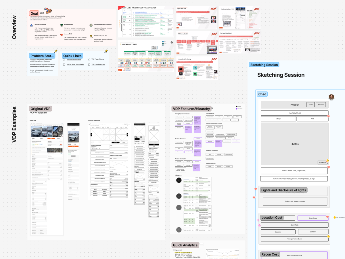
Timeframe: March–July 2023, spanning a design sprint, research, prototyping, and validation.
External Company Link: ACV Auctions
Overview
Primary Impact:
Replaced a one-size-fits-all page with a modular decision system that scaled across products and buyer types.
Secondary Impacts:
Reduced confusion around vehicle condition and disclosures. Improved confidence at the moment of bidding. Established a foundation for future channels and inventory types.
Role: Principal Product Designer
Scope: Core marketplace experience, platform-level information architecture, desktop and mobile surfaces.
Why This Is Hard: Buyers make high-risk decisions with incomplete information, while the business must support many products through a single, coherent system.
Why Leadership Needed Proof
Leaders were concerned that a new vehicle display could slow dealers down rather than help them.
- There was a real risk that dealers would struggle to place bids, interpret damage, or feel confident enough to act.
- A failed redesign could cause dealers to revert to the old experience and lose trust in future changes.
Leadership was blocked from:
- Committing to a full rollout without evidence the new approach was easier with positive dealer feedback.
- Aligning multiple teams around a shared direction while the solution felt nuanced and unfamiliar.
The risk leaders did not want to personally own:
- Betting adoption on a new interaction model that deliberately diverged from established patterns.
- Defending system-level alignment decisions without proof they would improve dealer behavior.
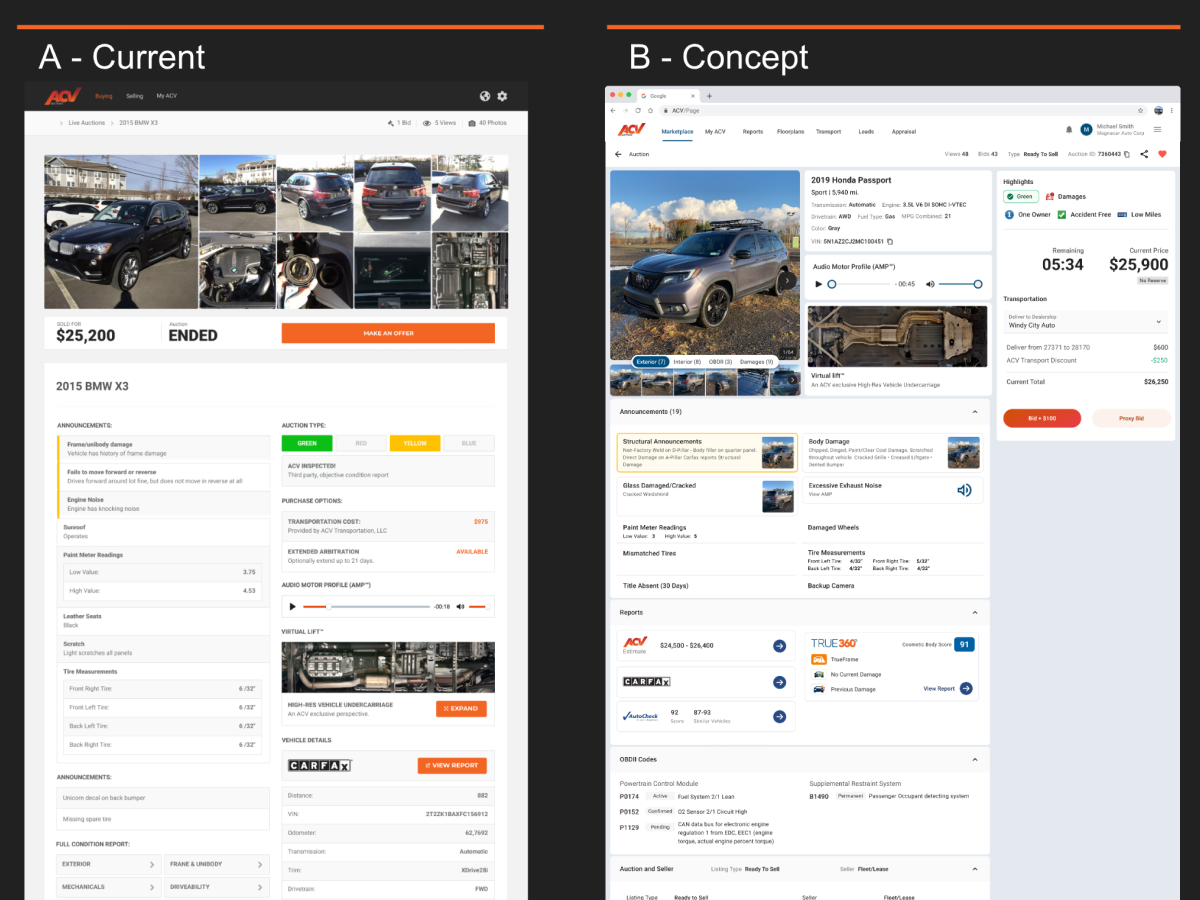
The Real Problem
What leadership thought the problem was:
The page was outdated and visually cluttered with a lack of hierarchy.
What was missing from that framing:
- Information existed, but it was not ordered the way buyers actually think.
- Trust issues stemmed from ambiguity, not from a lack of data.
The real problem I identified:
- The layout encouraged dealers to scan images first, even though thumbnails were too small to assess damage and too large to quickly orient to the page.
- Critical condition information was spread across multiple sections and pages, forcing buyers to mentally stitch together risk.
- The vertical flow worked against decision-making, slowing dealers as they moved toward placing a bid.
What would have broken if nothing changed:
- Dealers would continue leaving the page to validate condition elsewhere.
- Decision time would increase rather than decrease.
- Trust erosion would compound as new features were layered on top of a fragile structure.
The actual need:
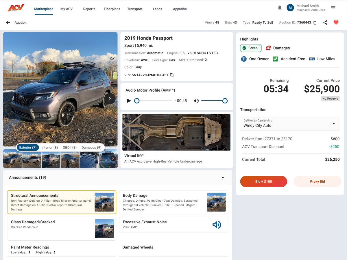
A single-page, decision-oriented layout that made condition and risk legible at a glance and supported a clear path to action.
Operating Model We Proved
Strategy: Design the page as a flexible platform rather than a fixed layout.
Mental model:
Start with what buyers check first when deciding whether to trust a vehicle. Surface risk early. Allow details to deepen only when needed.
What this replaced:
A static, bottom-heavy layout where critical information was buried.
What changes immediately when adopted:
Buyers orient more quickly. Fewer second guesses before action. Less need to leave the page to validate information elsewhere.
The Decision That Drove the Outcome
Reframe the Vehicle Details Page as a Decision System
Problem it solved: The existing page made it difficult for dealers to quickly understand vehicle condition, assess risk, and confidently place bids. Information was present, but not structured around how decisions were actually made.
Options considered:
- Incrementally improving the existing layout and feature hierarchy.
- Adding clearer summaries while preserving the underlying structure.
- Fully re-architecting the page around buyer decision-making.
Tradeoffs accepted:
- I did not preserve the existing layout or feature placement.
- I accepted higher upfront alignment, research, and validation costs.
- I constrained flexibility in favor of clarity and consistency.
Decision: I rebuilt the Vehicle Details Page as a single, modular decision system by:
- Reorganizing information architecture around how dealers evaluate trust and risk.
- Surfacing condition and risk signals early, before deep detail.
- Designing modular components that could adapt across products and channels without fragmenting the experience.
Why this worked: Taken together, these choices reduced cognitive load, aligned the experience to real buyer behavior, and created a scalable foundation for future business lines.
Proof: In testing, dealers consistently preferred the new experience, found critical information faster, and expressed higher confidence without leaving the page for validation.
Evidence and Validation
Usability testing:
- 8 moderated qualitative interviews with active dealers across experience levels.
- Side-by-side concept testing comparing the existing Vehicle Details Page with multiple new variants.
- The preferred concept consistently outperformed both the current experience and alternative designs.
Preference and clarity signals:
- Dealers repeatedly described the new layout as easier to understand and faster to scan.
- Participants located condition and damage information more quickly without guidance.
- The experience was characterized as organized and intentional rather than overwhelming.
Representative dealer feedback:
- “I can tell what I’m getting into much faster here.”
- “This makes it easier to decide if I even want to keep going.”
- “Everything I care about is in one place now.”
Behavioral validation:
- Dealers spent less time jumping between sections or external tools to confirm trust.
- Risk assessment happened earlier in the flow, before deep inspection, reducing wasted effort.
What would not have happened otherwise:
- Leadership would not have approved a system-level directional change.
- Teams would have continued shipping incremental fixes on top of a fragile structure.
- The platform would not be positioned to support future channels and inventory types.
Reflection
Capability unlocked: This work reinforced that the greatest impact comes from first-principles problem framing paired with strong UI and UX execution, rather than optimizing within inherited constraints.
How this changed my approach: Early, open exploration with other designers helps surface stronger problem definitions. My strongest contributions come when I am trusted to think deeply, reframe the problem, and then execute quickly with clarity.
What I look for next: Problems where I can operate end to end, apply first-principles thinking, collaborate to sharpen ideas, and move fast once the right direction is clear.